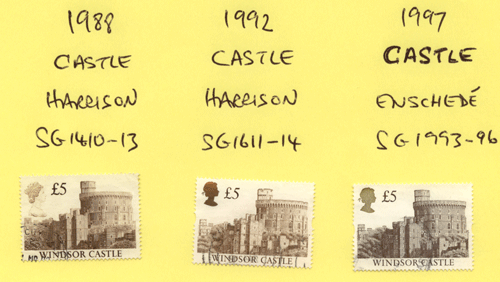
Hello, well thanks for the emails on the Castle stamps. You guys all know more than me.. how good is that.. :-) I hope the following scans are useful for those who may not be so conversant with the different printings. This first scan is my pretty awful attempt to show the three stamps.. I usually say unless I do something really well I should not show it but I really want to show you something and while this is not the best display I really need some sleep so hope you will accept this for my best effort this time.
 This second scan is better as it shows the different fonts of the three stamps more clearly.
Also, here is some info I was sent: I am using it as it explains these stamps in straightforward terms.
Three printings : 1988, 1992 , 1997 and changes in between
Queen's Head :
1988 = in profile like a cameo
1992 = silhouette in ink that changes from green to gold
1997 = ink is smooth because silk screened
Perforations:
1988 = regular all sides
1992 = elliptical cut out both vertical sides1997 = same but slightly different position
Colours: different shades of same colours in one pound and three pound stamps
Re-engraved :
1992 to 1995 = to increase stamp detail
1997 - the word CASTLE is in different type face - different printer
Denominations:
1992 = add three pound stamp
1997 = no one pound stamp
1996 = gum type changed
Anyway, I always enjoy sorting these stamps if I ever get them in old collection as I never know what I will find. Hope you enjoy looking more closely at any of these that you have. And finally……….. this is by no means meant to be an exhaustive catalogue description of the stamps.. it is a simple guide to help you get started and maybe enjoy these stamps a bit more.
Enjoy your stamps…… Best wishes… Michael
posted by cddstamps @ 4:35 AM
![]()


0 Comments:
Post a Comment
<< Home