What’s in an Image Part II?
Hello and welcome to Part V of my series Caveat emptor. In
the last part I talked about images that
show a set of stamps all touching each other, and how this means you actually do not see
all that you would buy if you purchased
the lot for sale as shown.
Continuing the theme “what’s in an image” I thought I would
talk about the quality of the image this time.
This can be a subjective topic of course, as what one person
sees might be different from another if
only because the computer screens each are using give a better or worse image resolution. Or maybe the viewer is looking at the stamps
from, for example, an iPad or equivalent notebook or even a phone. Maybe the
lighting conditions at the viewing location are different. There may be,
and often are, also differences in the quality of the scanner being used
by the seller, or the scanner settings, so this will also give a different
image presentation of the stamp being scanned and displayed to the potential
buyer.
There are many factors but ultimately let’s take a
reasonable view and say all things being nearly equal what’s in an image? Yes it
comes down to buyer beware doesn‘t it. Well mostly it does.
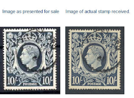
I saw a stamp for sale and decided to prove to myself that
what was being shown was not a reasonably correct representation of what was
being sold. Yes, I bought the stamp and
when it arrived I compared the “screen for sale image” with the “actual stamp I
had in my hand”.
All things being equal I think you will agree there is a
rather significant difference. Fortunately for me the price was not high. Had it been I would not have tried the
experiment but I was pretty sure I was correct in my thinking. So buyer beware when viewing an image – take
into account the price and ask yourself, especially if you do not know the seller
or have not had previous dealings with the seller, is this a fair price if the actual stamp is
not, let’s call it, as “clean” as it appears
to be.
Another aspect to look out for is this: has the image been,
let’s call it, enhanced. I am on shaky
ground here because some may say I can have no idea whether the image was enhanced
or not and it is possibly unprofessional of me to even suggest it without proof
in advance. I accept that but I will
show some examples and let you be the judge – let you make the assessment - is this really the colour, shade, or even
the whiteness or brightness shall I say of what a normal actual copy of the stamp
looks like? Ask yourself, is this really
what the issued stamps looked like? Buyer beware!
Fig 1 below – can this stamp really have such whiteness and
depth of brown? Can the black backing
paper really have such white spots on
it? Was this stamp issued with such whiteness and depth of brown colour contrast?
Fig 2 -
Image as per scan from my stock Fig 2a – Fig 2 enhanced with “colour correction”
This stamp was issued in May 1935, 85 years ago. Given the printing technology of the day, the paper used and the ink used, what is the probability the colour today would be as in Fig 1?
The stamp shown in Fig 2 and Fig 2a is from my stock. Fig 2a
is just one click on the computer – “auto
colour correction”. Buyer beware!
I use the
example of “auto colour correction” but
there are of course other methods involving
chemicals for example, "washing" stamps is a more common expression but again Buyer Beware!
I am using a stamp with no significant value for this example
but a more expensive stamp could be a different matter. So, perhaps a rule of thumb might be - If a
stamp looks too bright, that is, maybe too white or the colour too light or dark
or pure shall I say, then maybe the image colour has been adjusted in some way,
even if that way is simply by the settings on the scanner, which are not allowing
for a very correct image representation of the actual image being scanned. What
you get may well look different from what is shown on the screen, and if it does
not then perhaps that raises other concerns.
You be the judge! The stamps on the left are from our stock.


0 Comments:
Post a Comment
<< Home